Who’s ‘lying to people’?

I think most Americans would be well served to keep a few simple rules in mind: don’t challenge LeBron James to play one-on-one, don’t expect to beat Tiger Woods at golf, and don’t debate economics with Paul Krugman. Especially if you’re Fox News’ Neil Cavuto, and you don’t know what you’re talking about.

Princeton economist and New York Times columnist Paul Krugman went on Fox News this afternoon to talk about his new article in Rolling Stone Magazine, “How the Super-Rich Are Screwing America.”

Krugman’s article is about how income inequality is getting worse and, as a result, even though some aggregate economic indicators are positive, most people aren’t benefiting. Cavuto told Krugman, “Here’s what I’m saying that you’re doing: You are lying to people.” Cavuto claims that income inequality isn’t “dramatically worse now than 10 years ago, 20 years ago.”

Actually, Krugman is completely right: things are dramatically worse now than 10 or 20 years ago.

The Economic Policy Institute even offers a handy chart that even a Fox News host should be able to understand.

inequality

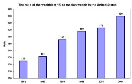
As TP noted, this “tracks the ratio of the wealthiest 1 percent of Americans to median income in the United States, a standard measure of income inequality.” It also, coincidentally, shows that Cavuto is wrong and Krugman is right. Go figure.

After Cavuto accused Krugman of lying and being “snide,” he got into the substance:

CAVUTO: No, no, you’re mentioning good data. You’re saying there’s a growing divide between the haves and have nots. Others have argued that very effectively and very eloquently, just like you. All I’m saying is that the math that applied now, can’t you apply it in other periods, when there have been Democratic presidents who’ve had the same dislocations? You’re saying that it’s somehow dramatically worse now than it was 10 years ago, 20 years ago?

KRUGMAN: Yeah, actually, it is dramatically worse now than it was 10 years, 20 years ago. All of the measures of inequalities have just gone off the charts. It didn’t start with Bush — and I actually say that if anybody, you know, buy Rolling Stone, read the article — it actually starts even before Reagan, so this is not just Bush. The point of the matter is that, when, in these last five years, as it’s becomes clear that this is a really growing problem, that most people are not sharing in the economy’s growth, the policies of Bush have been at every point to push that inequality further.

I’m sure Cavuto’s on-air apology will be forthcoming. Any minute now….

My favorite Krugman on-air moment was a couple of years ago on CNBC when he appeared with Tim Russert and Bill O’Reilly (what a weird trio) and kicked O’Reilly’s ass.

Mr. O’REILLY: You’re a quasi-socialist.
[snip]
Prof. KRUGMAN: …And you take a look at anything I’ve written about economics, and I’m not a socialist. You know, that’s a slander.
Mr. O’REILLY: I said quasi.
Prof. KRUGMAN: Well, that’s a wonderful–then you’re a quasi-murderer. I mean, why–what…
Mr. O’REILLY: I’m a quasi-murderer?
Prof. KRUGMAN: Well, quasi is a pretty open thing.
Mr. O’REILLY: That’s ridiculous. All right.
Prof. KRUGMAN: Right. I’m nowhere close to that.
Mr. O’REILLY: I think we defined where we both are on this.

  • The point is that the growing disparity is having two effects.

    One, it is making the economy seem to grow overall while the median and average Americans feel like they are stuck in neutral. Thus it masks their dilemma while confusing the insta-pundits about why some of America is not happy with the Bushite economy.

    Two, it points out to the honestly-merely rich (doctors, lawyers, bankers) that there is a tier of grotescly-dishonestly super-rich (CEO’s, investment bankers, hedge-fund managers, politicians) who are “making” money off the rich’s investments by gaming the system and lobbying for loopholes and cheats.

    And that’s why it’s beginning to be noticed.

  • ‘Prof. KRUGMAN: Well, that’s a wonderful–then you’re a quasi-murderer. I mean, why–what…
    Mr. O’REILLY: I’m a quasi-murderer?
    Prof. KRUGMAN: Well, quasi is a pretty open thing.”

    When you write a book that rather unsubtly equates you to the book’s “hero” who goes around killing all his “enemies” who rather unsubtly relate to all your “enemies” than yes, you’re a quasi-murderer.

  • Actually, it’s much worse — the disparity didn’t grow much at all between 1962 and 1983. Then, during the Reagan administration, it shot up (see 1989). Then things were relatively flat over the next 12 years, but shot up again between 2001 and 2004. It’s a Republican thing — apparently, we just don’t understand.

  • Cavuto’s an idiot, because he asked the wrong questions. I think this ratio could be a bit misleading… does anyone have the any of components that make this ratio up?

    Here’s why… The old saying, “The rich get richer” has a real meaning. The ubber rich are always going to skew the ratio higher driven by the simple mathematical laws of compounding… their wealth will most likely grow at a faster rate than the median household as the rich’s millions or billions make additional millions or billions by simply sitting in bank accounts accounts or invested in other assets such as real estate or the stock market while the median household is unable to save at such a rate because a greated their wealth is typically reivested in everyday living expenses.

    So when you simlply look at the ratio between the top 1% of the wealthy vs. the median wealth, by the laws of math it will should always tick higher in a growing economy — especially when the stock or real estate markets are doing well since the ubber rich have so much of their money socked away in it. Notice that the ratio’s growth rate decelerates in the period 1998-2001 when the stock market crapped out. It reaccelerates in 2001-2004 with the stock market’s bounce.

    What’s also interesting is the period between 1983-1989, the compounded annual growth rate of the ratio was 2.95% per year vs only 2.37% in the 2001-2004 period, so the assertion that “the policies of Bush have been at every point to push that inequality further” seem a bit misleading when the ratio has grown at a faster clip in past periods.

    Bottom line: I’d like to see the underlying statisitics of median wealth growth during the same time period. My bet it grows at a pretty healthy clip, clearly not at the rate at the ubber wealthy, but if the tide is lifting all boats at an acceptable clip, should we really care that 1% boats are being lifted at a faster rate??

  • JRS Jr — get a clue — you’re comparing the Bush administration to the Reagan administration. Another time of tax cuts for the rich and corporate welfare…

  • What’s also interesting on the chart above is that the time periods vary between each bar shown… why not lay out the ratio in a line graph that consistently shows the ratio every year???

  • Sorry one more:

    As CB pointed out, the data is from the Economic Policy Institute who’s tag line is “Research for broadly shared prosperity”

    Hmmm… Now they they wouldn’t never have an agenda when they presented data, would they???

  • Of course, JRS Jr, you are giving a good reason why not only should taxation be progressive, but also, why taxing the rich at higher tax rates shouldn’t be painful at all to them – because it’s much easier for them to make more money than the rest of us.

    What struck me about the chart was that even back in the old pre-Reagan days when the marginal tax rates were much higher than they are now, and even before 2001 when Bush and the GOP seriously cut the rates for the rich, how the upper-most strata really did do well compared to the rest of us. We should keep this chart handy when it comes time to re-impose progressive tax rates that impact the rich – the bottom line is that they still do much better than the rest of us no matter how much they’ll complain and pretend that the case is otherwise.

  • Here’s a good book on the subject: “Screwed: The Undeclared War Against the Middle Class — And What We Can Do About It”:

    http://www.amazon.com/Screwed-Undeclared-Against-Middle-Currents/dp/1576754146

    Book Description (from Amazon.com):

    The American middle class is on its deathbed. People who put in a solid day’s work can no longer afford to buy a house, send their kids to college, or even get sick. If you’re not a CEO, you’re probably screwed.

    As Air America Radio Host Thom Hartmann shows, this death is no accident. Like the Founding Fathers, patriots such as Roosevelt, Truman, and Eisenhower knew that economic opportunity and democracy go hand-in-hand. They believed in maximizing the public good and they worked tirelessly to build the strongest middle class the world has ever seen. But now, under the guise of “freeing the market,” conservative and corporate forces are waging a covert war against the middle class, dismantling policies like Social Security, Medicare, the minimum wage, and fair labor laws — the very safeguards that foster economic opportunity and citizen engagement. The result is an economic system designed to line the pockets of the super-rich, the impending extinction of the middle class, and a very real, very dangerous threat to democracy itself.

    By exposing the systematic efforts to destroy the middle class, Screwed empowers readers to stand up, speak out, and reclaim their democratic birthrights.

  • After Cavuto accused Krugman of lying and being “snide”

    Snide? I thought Krugman had been diagnosed as being “shrill.” Patient Zero, in fact.

  • JRS Jr — what’s your problem? Maybe I need to be a little clearer for you:

    You compared the Bush administration to the Reagan administration. So, your point was “Bush wasn’t as bad as Reagan.” My point was that that’s kind of a straw man.

    I do agree with your point that we should have year by year data. However, I imagine they will show that the disparity went up even more from 1981-1983, given the recession, etc.

  • #4 and 8 hit it on the nose. I just created a linear chart and it shows the significant increases in the gap that occur during the Reagan and Bush-2 eras. The chart as it stands does a disservice to the argument.

  • I don’t disagree with Krugman, so please don’t take this comment to be in disagreement with the overarching topic being discussed here.

    However, the chart really is misleading, in a couple of ways.

    First, it starts at 100 rather than at 0. This has the effect of magnifying the difference between the bars. Looking at the chart it looks like the bar for 2004 is nearly 4 times as tall (400% increase) as the one for 1962. Actually the value 190 is 52% more than the value 125.

    Second, the years chosen seem arbitrary. They are not evenly spaced in time, but they are evenly spaced on the chart. The chart makes it look like there has been continuous growth since at least 1962. Perhaps there has, I don’t know but I’m left wodering what happened between 1962 and 1983 (a 21 year span of time) that makes it warrant the same amount of space on the chart as what happened between 1998 and 2001 (a 3 year span of time).

  • You can make statistics support amlons any position, 85% od Americans know that. (hat tip Homer Simpson)

    Since when does talk show host qualify Cavuto as an economist? Not that it matters because FOX never let math or science get in the way of a good Neo-Con talking point.

    I agree with DDD. JRSjr. is correct and his point about the power of wealth and compound interest. All this supports progressive taxation. If I have $10MM and I can earn $100,000 a year just because of interest (through no effort or contribution to society) I will get richer, faster.

    The Super-rich do not benefit the economy, they could never spend the money fast enough. Go watch Brewster’s Millions if you don’t believe me. I will lose no sleep when the super-rich have to give thier un-earned income back at some helpful rate. I should have such a problem.

    Leave it to a Conservative to suggest that getting $X in free money each year is a burden just because they could have had $X2 in free money.

  • Does anyone know where I might find data on median wealth and wealth of wealthies 1% by year for the past half century or so?

    I’m somewhat interested in generating my own chart that presents a less biased view.

    I tried looking at the Economic Policy Institute website, but aside from the chart included in CB’s post, I can’t find anything on wealth, only income.

  • However, the chart really is misleading, in a couple of ways.

    First, it starts at 100 rather than at 0. This has the effect of magnifying the difference between the bars. Looking at the chart it looks like the bar for 2004 is nearly 4 times as tall (400% increase) as the one for 1962. Actually the value 190 is 52% more than the value 125.

    A ratio chart isn’t supposed to show a rate of increase – all it’s supposed to show is the change in a relationship between two values – one of which is always set at 100 (which then easily shows the change in the relationship between them at different observations). In this case, what the chart endeavors to show is not that that there was a “400% increase”, but that at one point in time one value was worth 26% more than the other, and at another point in time that same value was now worth 90% more than the other. Without knowing what the actual value of the median income of the US is that it is being compared to, there is no way of telling what the actual % change of the wealthiest 1% of Americans was – all the chart is showing is it’s relationship in percentage terms to the US median income.

    It’s not misleading at all – you’re just looking for it to say things that it isn’t trying to say. Same thing with the choice of dates – it’s not trying to illustrate rates of growth or whether it was continuous or not. All it is doing is showing snapshots of particular dates. Whether or not the “growth” was continuous can be inferred, or even attempted to be disproven by showing different observations in different years. But as that disproval is highly unlikely, it’s relatively unimportant. Again, it’s not the rate of “growth” that’s important here – it’s the illustration of observations at different points in time.

  • Wingnuts always say, “I don’t agree with your data so you’re lying.” It always boils down to name-calling and accusations of lying.

    The progression over even periods of time is not the important part of this chart. It’s the progression itself.

    BTW, 2% owning 50% of wealth and 50% owning 1% of wealth isn’t just skewed, it’s fucked up.

  • Racerx @ #12

    Good book.

    I heard Hartmann interviewing someone from a conservative think tank, can’t remember the name, on the same topic the other night and Hartmann cleaned his clock.

  • “just because of interest (through no effort or contribution to society)”MNProgressive

    In order to earn interest, there is always some contribution to society. If the money is tucked away under a mattress it can’t be used by society, and it won’t earn interest (actually it’ll lose value to inflation). In order to earn interest, the money HAS to be given to someone else so that they can use it. Then, when they are done using it they give it back along with a bit extra to compensate for the loss of use by the owner of the money during the time the borrower was using it. The borrower is essentially renting the money for a period of time, much like you might rent a car. When you’re done with the car you give it back and pay a little to cover the usage.

  • “You compared the Bush administration to the Reagan administration. So, your point was “Bush wasn’t as bad as Reagan.”

    That’s not my point at all! You folks are falling into the Occam’s Razor Phenomenon, by making quick conclusions that Reagan and Bush are at fault for this rising disparity.

    Perhaps rising asset values driven by stock market rises was a big contributor??? In the 1983-1989 period stock prices rose ~150%, or at a CAGR of 10.7% per year and the market is up almost 8% per year in the from the end of 2001 to 2004 period.

    As a few have now pointed out, the chart, as presented is misleading. (And from the data presented, you can’t just create a linear chart mnamna). Show me ALL the data.

  • “A ratio chart isn’t supposed to show a rate of increase – all it’s supposed to show is the change in a relationship between two values – one of which is always set at 100”DeepDarkDiamond

    And with this statement you prove my point about how easy it is to be mislead by this chart. I thought the same as you until I checked out the actual description of the chart at the Economic Policy Institute website.

    According to that website (where this chart came from) a value of 125 means “The richest 1% of wealth holders had 125 times the wealth of the typical household in 1962” not that “one value was worth 26% more than the other”. On this chart the value that you claim is typically set to 100 (I believe you are refering to the median income) has actually been set to 1, so minimally the chart should start at 1, not 100.

  • Actually, the commentary at TP the CB quotes is misleading – the EPI Institute chart and data reflects “wealth” – which is much different from income. Income is how much an individual (or family) earns within a year – wealth is the total stock of value at any given time that a person or family possesses. They are 2 completely separate animals (sort of like the difference between the annual budget deficit ($400 billion/year) and the total US debt obligation (something like $32 trillion dollars ??) and it is misleading to talk about one when one means the other. The chart in question strictly comares “wealth” and has nothing to do with “income”, contrary to what TP says.

    You’ll have a hard time finding these kind of “wealth” statistics, Danny.

  • JRS Jr, you overlooked inflation which has created negative growth for the middle and lower class wealth.

  • According to that website (where this chart came from) a value of 125 means “The richest 1% of wealth holders had 125 times the wealth of the typical household in 1962″ not that “one value was worth 26% more than the other”. On this chart the value that you claim is typically set to 100 (I believe you are refering to the median income) has actually been set to 1, so minimally the chart should start at 1, not 100.

    You’re right, Danny. That’s extremely misleading.

  • “All it is doing is showing snapshots of particular dates”DeepDarkDiamond

    And my point is, why these particular dates. Neither the chart nor the description that accompanies the chart at the Economic Policy Institute give any indication as to how or why these particular dates were chosen. They seem rather arbitrary. Dates that are evenly spaced would at least give an indication of how much worse or better things have gotten over time.

    You say, “it’s not trying to illustrate rates of growth or whether it was continuous or not.”, but then you follow that up by saying, “Whether or not the “growth” was continuous can be inferred”, and that is one of the things I am saying is wrong with the chart. It creates a visual representation of continuous growth, and creates a situation where the average viewer will assume the growth was continuous over the time period represented. However, without an explanation of why the chosen dates were chosen, it is quite possible that things were MUCH WORSE than a ratio of 190 between 1992 and 1998, or between 1999 and 2001. We don’t know from this chart, and we don’t know why we aren’t being told.

    I personally doubt that things were worse, but by leaving significant periods of time out, and then spacing them evenly across the X axis of time, the chart creates a misleading representation and leaves me wondering why.

  • “You’ll have a hard time finding these kind of “wealth” statistics, Danny.”DeepDarkDiamond

    It seems that the EPI must have the statistics. They supposedly used them to create the chart. They got the data from somewhere.

    Why release the chart but not the underlying data? Why only chart particular years? How were the charted years chosen? I’m willing to accept that the chart is technically accurate, but why release such a misleading chart?

    The bias doesn’t even seem consistent.

    First, they choose to compare against a median set to 1 rather than 100. Many will look at the ratio and think it is 125:100 or 190:100 and think that the wealthiest 1% have 25% or 90% more wealth than the median wealth, when in actuality the ratio is 125:1 or 190:1 meaning that the wealthiest 1% have 12,500% or 19,000% more wealth than the median wealth. This reduces the visual impression of the disparity between median and top 1%.

    Then they choose to start their chart at 100 rather than 1. This magnifies the difference between the bars on the chart and increases the visual impression of the disparity between the various years represented.

  • #23 Danny

    “In order to earn interest, there is always some contribution to society.”

    I was referring to work. I do not perform a service or deliver a tangible product. Obviously, allowing others to use my money in return for my money plus a little more is a contribution. It does not, however, require anything more than too much money.

  • The Census has a wealth of data on income distribution over time.

    It is the source the EPI used.

    all you have to do is go to census.gov and use the search engine.

  • “It does not, however, require anything more than too much money.”MNProgressive

    True, and for that matter it doesn’t even require “too much” money. All it requires is some money that you don’t need the use of for a period of time, even those of median wealth will frequently have some sort of savings account which earns them some amount of interest.

    However, this “contribution” (letting others use your money for a period of time) benefits society in many ways. I know, I know, this sounds a lot like “trickledown econimics / voodoo economics”, but I’m not saying that this is the “best” use of the money, just that allowing others to use ones wealth for a period of time allows our country to borrow money when it needs it (Treasury Bills, Bonds, etc). Allows people to purchase a home (mortgages), Allows persons of median wealth to start up a new business and attempt to acquire wealth of their own (business loans). In many ways it is the earning of interest that makes the “American Dream” possible.

    My point is that it may not be entirely accurate to say, “The Super-rich do not benefit the economy”. There may be better ways to benefit the economy, but that doesn’t mean they don’t benefit the economy at all. Get rid of all the new business ideas, and entrepenuers. Get rid of loans, and remove from the government the ability to borrow money when it is needed, and you might find a pretty bleak picture.

  • Trace a curve through the points of the chart and look at the slope. The curve flattens (slower growth of disparity) during Democratic administrations and rises (higher growth of disparity) during Republican administrations. This is damning!

  • #10 The data on income is available from the NIPA accounts. Go check the Bureau of Economic Analysis (BEA) website. You can download the time series and do your own calculations (you do know how to calculate a median, do you?).

    The BEA is a government agency. Just in case you think the BEA is some leftwing think tank that fudges the numbers…

  • “Trace a curve through the points of the chart”Devil’s Advocate

    Unfortunately the data given really isn’t sufficient. You are tracing a curve through 21 years of space that has no data representing it (from 1962 to 1983) connecting these 2 years creates a relatively flat line when we really don’t know if it should be flat at all, and then you are also tracing a curve through 10 years where there is data every three years (1996 to 2006).

    This damn chart isn’t damning, it’s misleading and poorly thought out.

  • “The data on income is available”Devil’s Advocate

    As someone already pointed out. This chart really doesn’t have much to do with income. It is a chart of wealth. I haven’t looked yet, but does that BEA make available data on wealth that can be downloaded?

    “Just in case you think the BEA is some leftwing think tank that fudges the numbers”Devil’s Advocate

    I’m giving the EPI the benefit of the doubt and accepting that the numbers represented are accurate, but the chart is misleading. I have no way of knowing if it’s intentional or accidental.

  • “The Census has a wealth of data on income distribution over time.”spencer

    I haven’t had a chance to look yet, but I’m hoping they have data on wealth as well. We’ve already established here that this chart is about wealth and not income.

    “It is the source the EPI used”spencer

    Where did you find this info? When I look at the chart at the EPI website, it says, “Source: Ed Wolff unpublished data, 2006.”

  • “The Economic Policy Institute even offers a handy chart that even a Fox News host should be able to understand.”

    Seems like CB (in all his wisdom), didn’t even quite understand the underlying misrepresentation this “handy chart.”

  • “Seems like CB. . . ., didn’t even quite understand”JRS Jr

    Lets give CB some credit (and the benefit of the doubt) here.

    The chart DOES show that in 2004 there was greater disparity between the median wealth and the top 1% wealth than there was in 1962, 1983, 1989, 1998, or 2001. So as long as we can all agree to accept the numbers as accurate, it does demonstrate that there have been times in the past that had less disparity than there was in 2004.

    The chart is misleading overall, and has caused several commenters to jump to baseless conclusions because of the way the data was represented, but that doesn’t mean that CB didn’t understand the underlying misrepresentation. He didn’t use the chart to state that:

    “disparity didn’t grow much at all between 1962 and 1983”

    “I imagine they will show that the disparity went up even more from 1981-1983”

    “that at one point in time one value was worth 26% more than the other, and at another point in time that same value was now worth 90% more than the other”

    “Whether or not the “growth” was continuous can be inferred”

    “The progression over even periods of time is not the important part of this chart. It’s the progression itself.”

    “Trace a curve through the points of the chart and look at the slope”

    These are the areas where the chart has misled someone.

    CB used the chart for perhaps one of the few things that it represents,that recent disparity (2004) was greater than disparity at some point in time roughly 10 years ago (1989 or 1998), and greater than it was at some point in time roughly 20 years ago (1983).

    I just wish there was a better less misleading chart available for CB to use.

  • My slightly more reasonable version of the chart can be found here:

    http://hotimg1.fotki.com/a/152_140/172_25/chart.gif

    (I’m hoping that I did that link right and that I won’t have to repost this)

    In this chart as currently posted, I’ve used the values from the EPI chart but started the Y-axis at 1 and filled spaced the bars on the X-axis in proportion to the difference in time.

    Unfortunately the mind still tends to connect the tops of the bars as though the intermediary years follow a linear progression. I have no knowledge as to wether they actually do or not.

    As soon as I find data to fill in the missing years, I’ll update the chart.

  • Danny,

    I looked up Mr. Wolff and found his paper at http://www.levy.org. His “unpublished paper” is from Dec of this year and has not been posted to the website, though the summary is there (if you search working papers by author name, you will find it).

    However, wealth and income issues are an area Mr. Wolff concentrates in and you will find a lot of his data in this paper of his from 2004.
    The paper is interesting, but you will find the data condensed in the charts at the end.

  • Danny,

    If you want wealth data, you can find it in the Flow of Funds data published by the Federal Reserve Board. You should use stock, not flow data. You are also going to have to add up the individual pieces. It’s work but you may want to do it.

  • Danny,

    You may also want to look at the SIPP survey from Census. It has asset data in addition to income data.

  • Like I suspected, a great deal of the wealth disparity is simply due to net asset growth (aka stock and real estate investments). So as the market rises (which it tends to do over time), the rich will get richer. I’m not sure we can simply ascribe the jump in disparity to fiscal policy.

    Income is a whole ‘nother ball game — which was what Cavuto and Krugman were talking about, unfortunately TP erroniously linked to the WEALTH chart and CB picked up his post without pointing out the difference of what they show.

    As far as I’m concerned, the chart is irrelevant to the topic covered on the FOX show.

  • ok – let’s look at just income disparity then. Take a look at a historical income chart put together by the census bureau showing share of national income going to different income groups over time

    From 1985 – 2005 – the bottom 20% of households share of total income decreased from 3.9% to 3.4% – a decrease of almost 13%. In the same period, the share of the top 5% households went from 17.6% to 22.2% – an increase of almost 21%. Since Reagan was elected President, the year-to-year share of total income made by the top 5% households has rarely declined, and has gone from 16.5% to 22.2%. SInce Reagan became President, the share going to the bottom 20% has only increased year-to-year once and has declined from 4.1% to 3.4%

  • “So as the market rises (which it tends to do over time), the rich will get richer.” – JRS Jr.

    Just so I’m clear, it’s fine by you that the grotesquely rich get grotesquely richer by making absolutely no effort on their part?

  • “Just so I’m clear, it’s fine by you that the grotesquely rich get grotesquely richer by making absolutely no effort on their part?”

    First, how can you say the ubber rich make/made absolutely no effort? Tell that to Gates and Dell, even lefties like Michael Moore. I’m quite sure they have done something to deserve their copious wealth. In fact, Dells and Gate’s contributions to society at large have pretty much allowed this very forum to exist!

    All I know if you start placing limits on the ubber rich’s investment appreciation and then they will stop making investments, thus hurting a large portion of investments in the whole economy and that hurt will certainly trickle down to the middle class.

    That said, I am in favor of some progression in tax rates and a meaningful tax on estate transfers of over $5 million as a means of redistribute wealth upon someones death.

  • As JRS Jr mentions, I too am in favor of some progression in tax rates, and in a meaningful tax on estate transfers.

    In particular I’d like a flat tax rate on income up to about 7% more than I make, and progressive rates for various levels above that. I’d also like to see a tax on estate transfers that exceed whatever amount my estate is likely to be worth upon my death 😉

    Oh, and on that progressive income tax, I’d like to see the startnig income for progressive tax rates be adjusted for inflation each year. 😉

  • JRS: “All I know if you start placing limits on the ubber rich’s investment appreciation and then they will stop making investments…”

    Oh, they’re going to take their bat and ball home and not play any more??? They’re going to take their working assets and turn them into idle assets by converting to cash in very large buills and stuff those bills in a huge mattress in their fortress homes?

    Can some moderate or conservative explain to me why they think it is okay for someone who has 2 million dollars invested as their only source of income through qualified dividends and capital gains, producing $100,000/year that they live off (allowing them to not WORK for a living) should only pay 15% on that income while a family that has to WORK for a whole $100,000 in income is required to pay close to 20%?

  • Can some moderate or conservative explain to me why they think it is okay for someone who has 2 million dollars invested as their only source of income through qualified dividends and capital gains, producing $100,000/year that they live off (allowing them to not WORK for a living) should only pay 15% on that income while a family that has to WORK for a whole $100,000 in income is required to pay close to 20%?

    Because someone already paid ordinary income taxes on that $2M in capital that earned (and accumulated) and was eventually invested!!!

    Taxing dividends is a form of triple taxation (1) Corporation already pays income taxes on its earnings (2) the investor pays taxes on the dividend (which is paid after the corporations income tax is taken into account) and (3) The capital invested in the corporation by the individual was onced taxed as ordinary income when the capital was originally accumulated!

  • JRS: Taxing dividends is a form of triple taxation

    This multiple taxation argument is a fallacy that has been used over and over again. There is no principle that says that a dollar can only be taxed once. When you buy a product from the local store-owner you pay sales tax on the dollar you give him. When he spends that dollar to buy somethign from someone else, that same dollar is taxed. It is the TRANSACTION that is taxed not the dollar.

    The corporation is a separate entity from the buyer who buys the corporation’s product and the corporation is a separate entity from the investors who receive dividends. As for capital appreciation in the general third party market for stock, that has nothing to do with the transactions that generated corporate income & thus corporate income tax. That is a market transaction between a prior owner of an instrument and the new owner of that instrument.

    I’m afraid your answer does not hold water. Income is income. You have not provided an ethical justification for a taxation system that taxes income that you have to WORK for at a higher rate than it taxes income that you don’t have to work for.

  • Comments are closed.